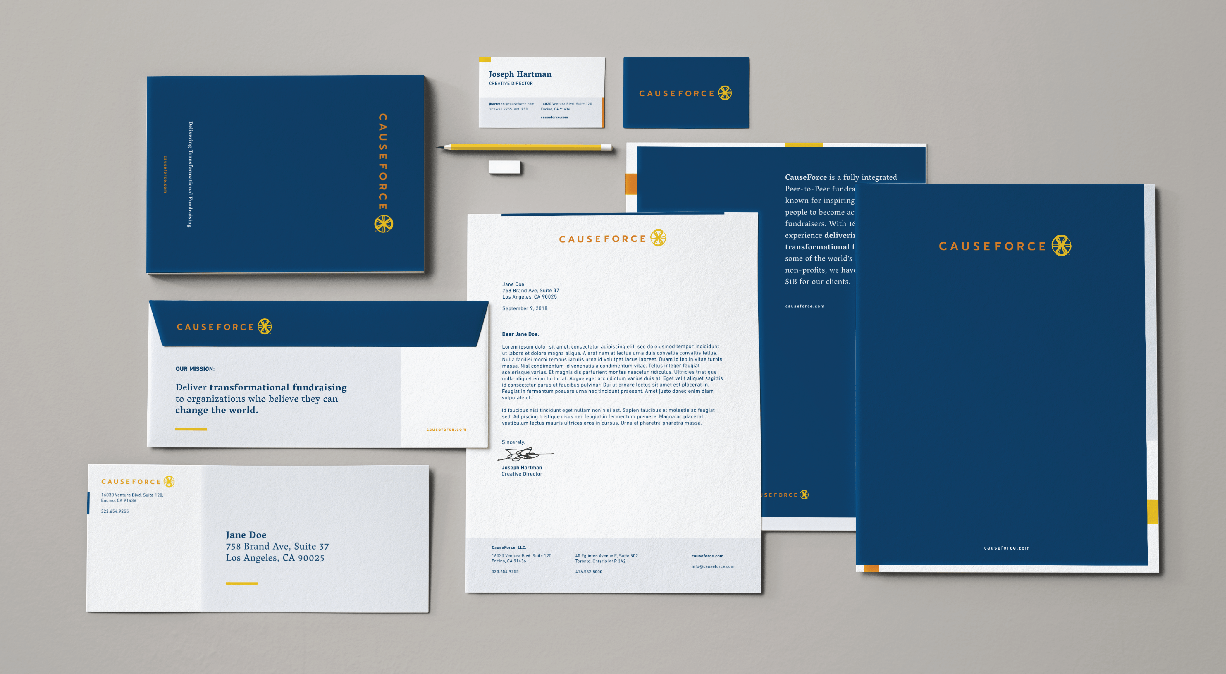
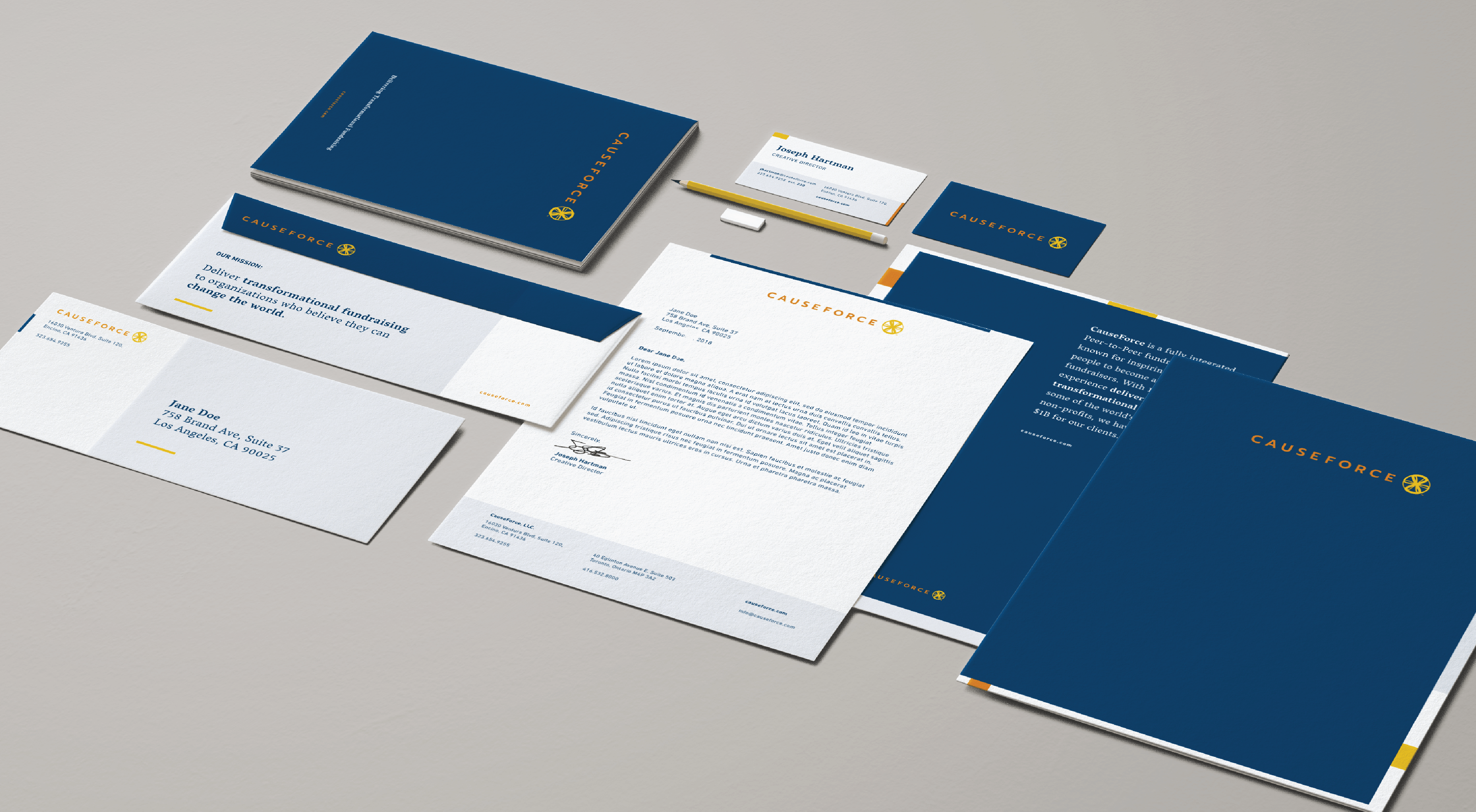
CauseForce’s new identity pays homage to the infinite possibilities that arise when you gather a community of individuals that believe change is possible by reimagining what an ecosystem of hopeful actions, outreach, and partnership looks like.
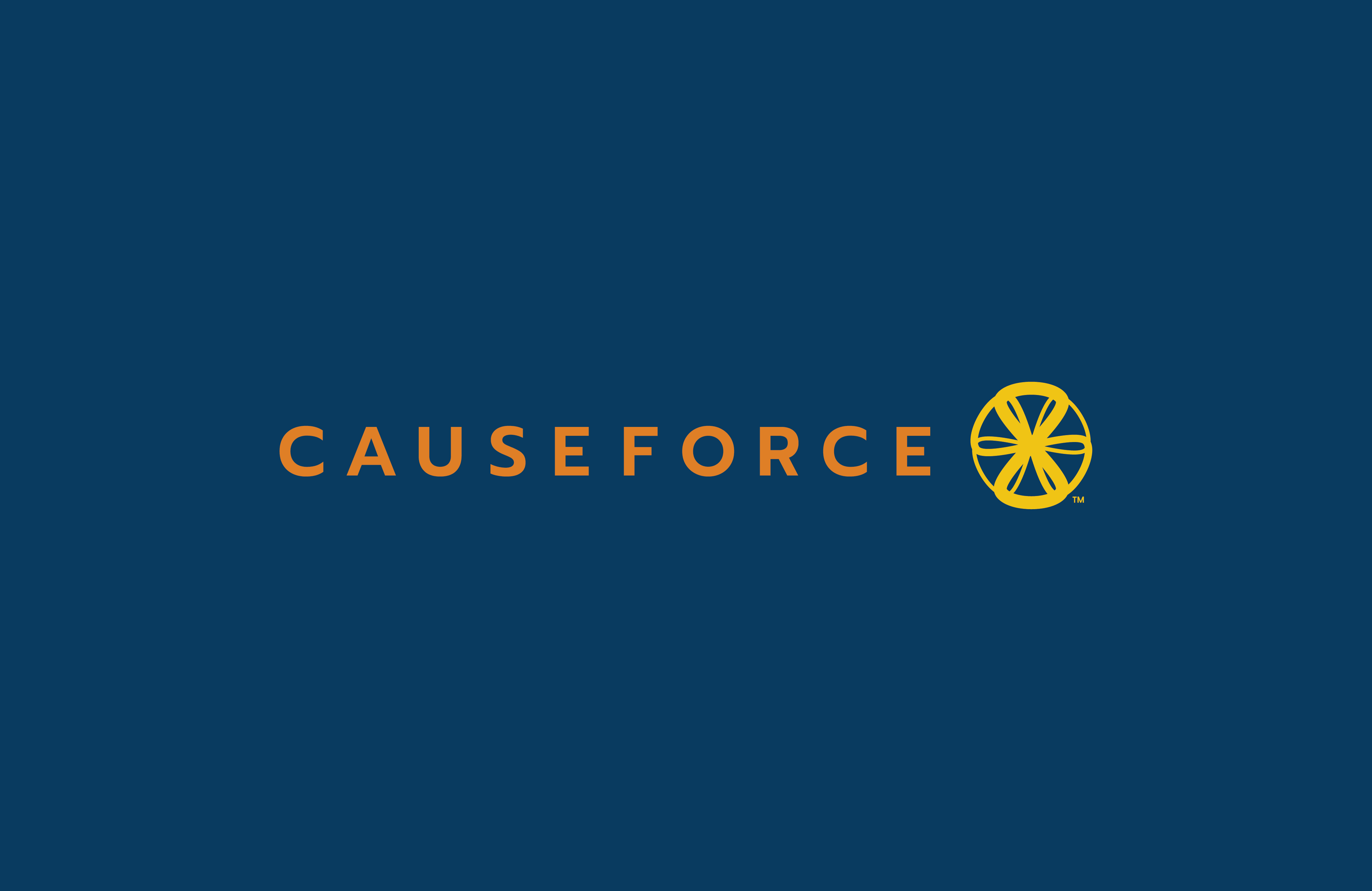
The organically floating nature of the new logo, infused with a developing crescendo of movement, instills a feeling of unstoppable growth. The three interwoven infinity symbols combine and duplicate, akin to the perpetual movement of a bicycle wheel, demonstrating collaboration and activity.
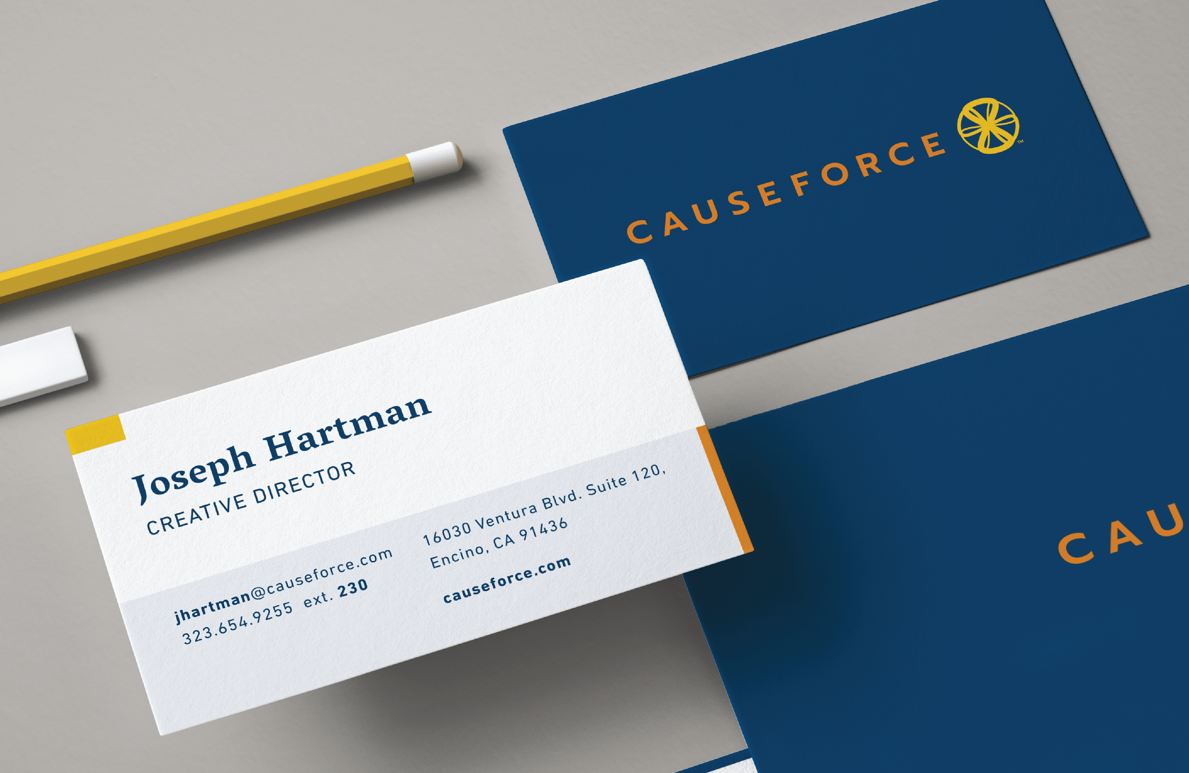
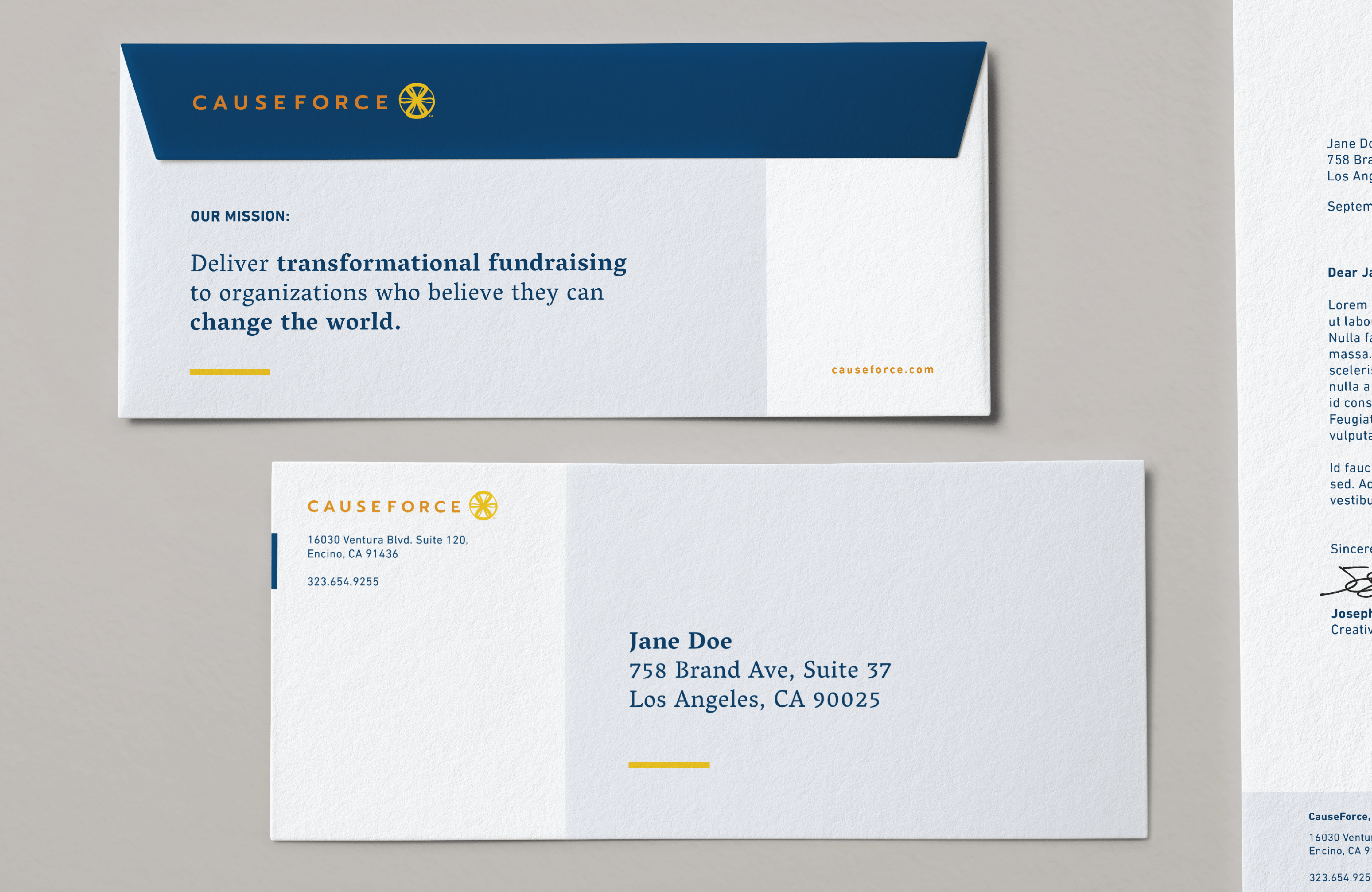
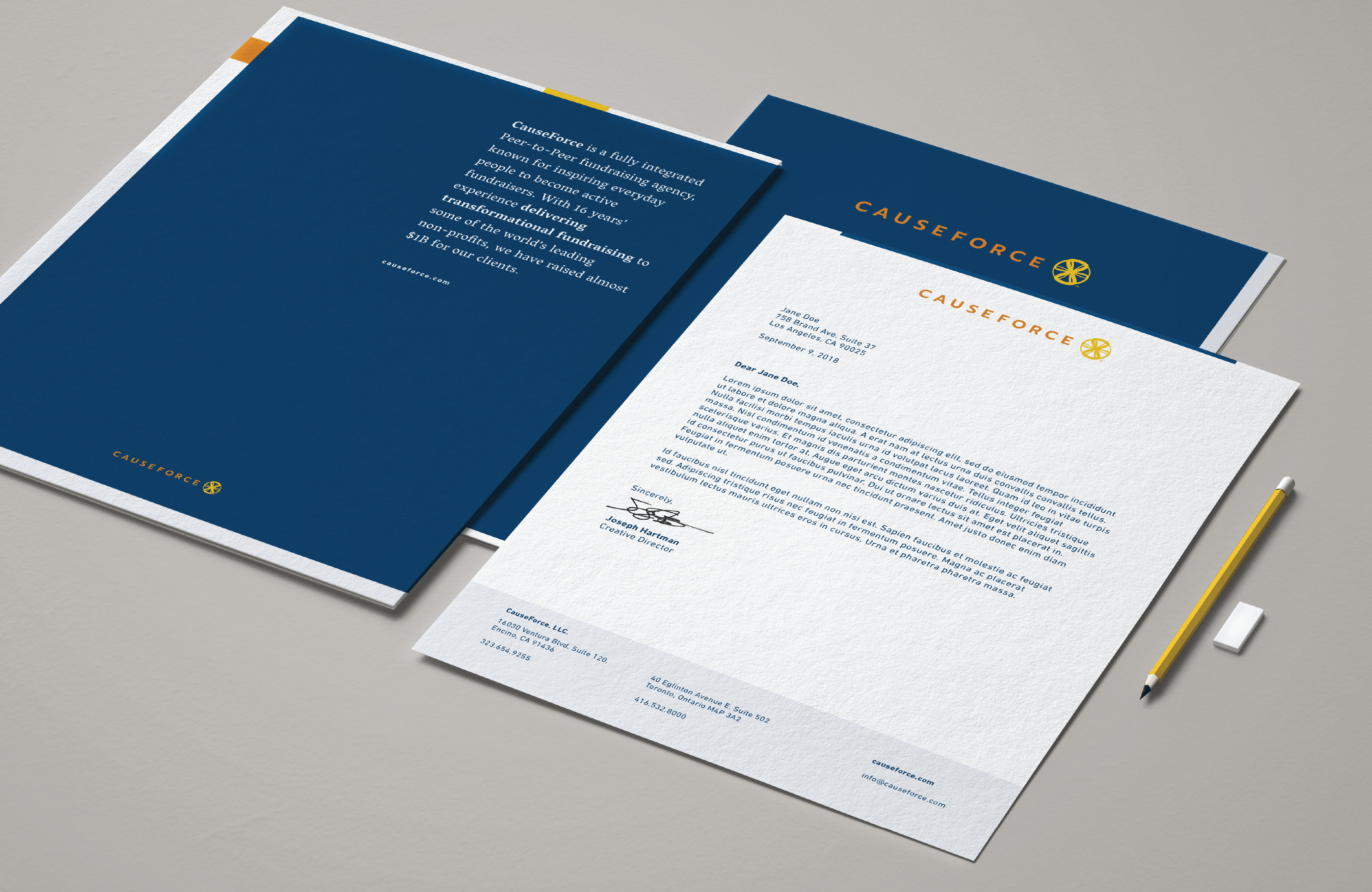
Using dynamically structured, simple typography with an asymmetrical grid and added elemental blocks, paired with an inspired and refined color palette, we create a thoughtfully annotated voice that speaks to the contemporary and professional new expression of CauseForce.
The result is an aesthetic that resonates the successful and positive impact our not-for-profit clients make on the world and the interconnection of services and resources that Causeforce provides.